What is a User Journey?
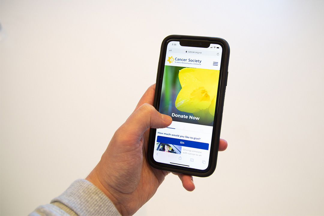
A user journey is the steps a user takes to complete a goal. For example, this could be making a donation on the Cancer Society NZ website. Step 1 would be landing on the website whether it be the home page or a specific landing page. And then each following step would be the online donation process including entering the amount the user wants to donate through to entering payment information.

Creating a user journey map
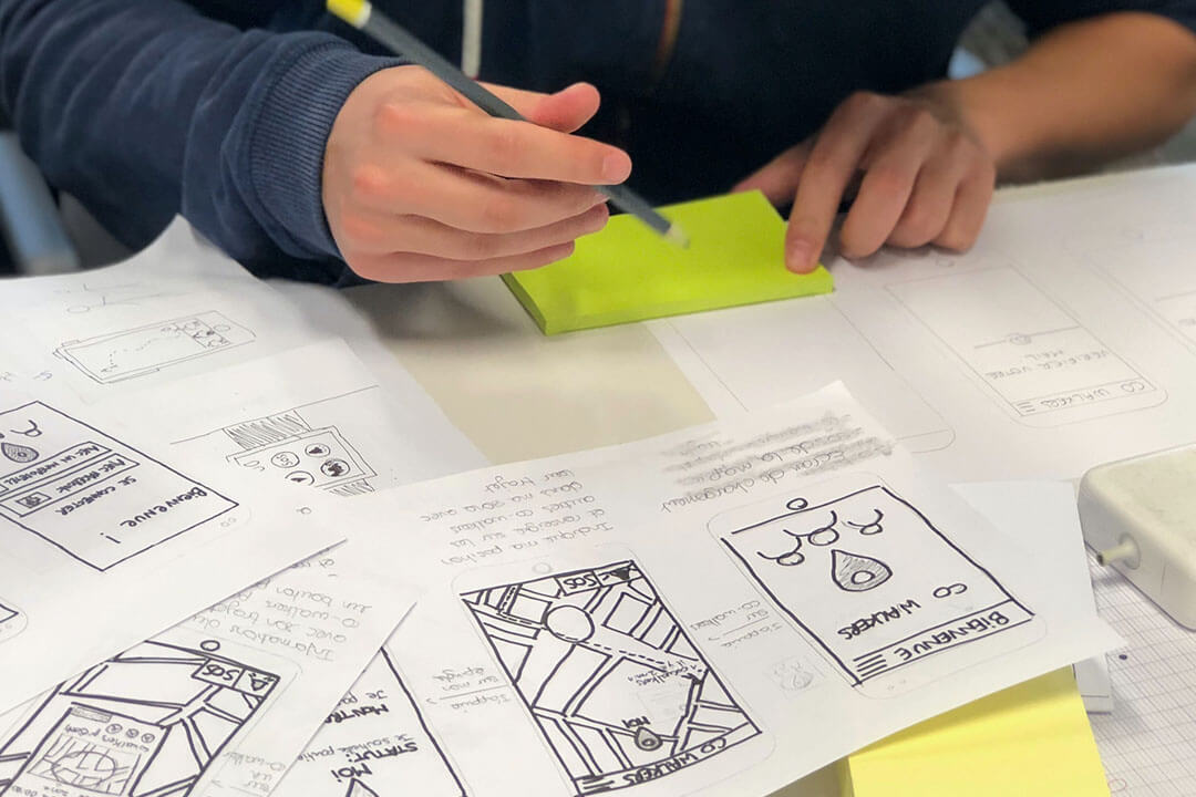
We like to map out the different journeys a user can take to complete a goal on the website. A user journey map visually maps out every engagement your users have with your service, brand, or website. We do this so we can focus on building a product that is optimized for the user. We want to make sure that we are designing and building something that helps the user complete the reason they came to the website in the first place. To best map out a User Journey, we need to first understand the user’s goals.
Understanding user goals
One way to help understand your user's goals is to create user personas. You can break down your users into segments to understand how different types of users would interact with your website and ultimately what they want from it. To figure out who your users are you can use market research as well as analyse your current website data to understand how users are interacting with it.
In the case of the Cancer Society website, not everyone who visits the website is looking to donate. Some people might be looking for information about a specific form of cancer or are looking at ways to volunteer at the Cancer Society. At Somar Digital we were able to tap into the Cancer Society's vast knowledge of their user base to inform how web design decisions were made related to the various journeys a user could take when on the website. We're then able to test these changes with users as well website analytics to make sure that the changes we made are actually making a positive difference.

Testing + Optimising
Once you have created a user journey map you can start to test it and see what parts of the journey need to be optimised. Ultimately you want to make the user experience as frictionless as possible. For the donation portal on the Cancer Society website, we added intuitive micro-interactions as well as cleaned up the design and usability of the forms which helped make the donation process more intuitive and efficient than the previous Cancer Society website. It's taken a lot of trial and error to figure what was working and what wasn't working. But by working closely with the Cancer Society team we figured it out what UX and UI changes were benefiting the user the most.
Conclusion
At Somar Digital, we’ve seen great project success when we map out User Journeys. It has and continues to help us understand how and why users will use the digital products that we design and build.
You can have a look at some examples of this on our projects page, which includes some of the great work we’ve done for the Mountain Safety Council, Citizens Advice Bureau, and Metlink.
If you want to get in touch with us about an upcoming project that you need a hand with you can contact us at this link.


