Designing a website or digital product for a charity or not-for-profit isn’t that dissimilar from how you would design a website for any company or organisation. At the end of the day, it comes down to knowing who your users are and optimising the experience for them whether that's attracting volunteers to sign up or for members of the public to be able to donate to your charity. At Somar Digital we’ve worked with a number of charities and not-for-profit organisations and have come up with some tried and true methods for designing strong web experiences. We have delivered accessible web design for nonprofits across New Zealand.
Telling your story and cause
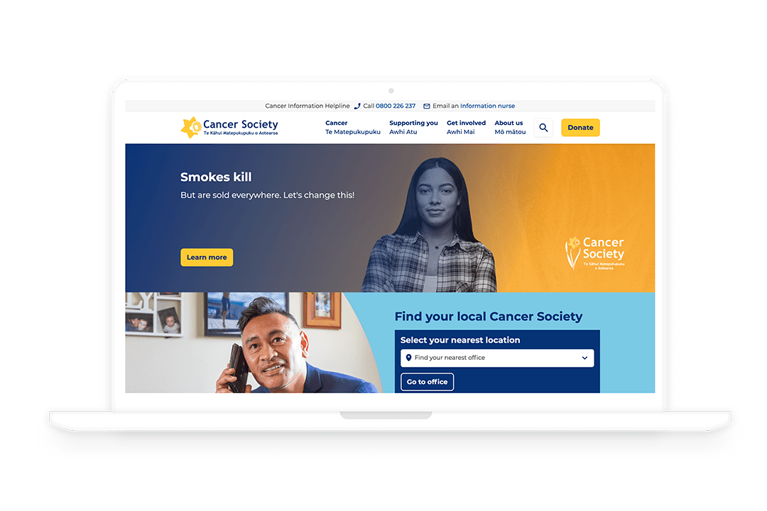
Even if it seems super obvious a user needs to know exactly who you are and what your charity does. Telling your charity’s story is important to help engage users and it gives them a clear idea of the cause that the charity is helping. The Cancer Society(external link) homepage features a stories section that lets users see stories from people who have experienced cancer which adds a more human dimension to the website and gives a good indication into the work that Cancer Society NZ does.
Visual Design
It can be a bit overwhelming to users if there is a lot of text on a page. Adding plenty of images and videos is an easy way to improve your web design as it adds more visual appeal to your website and can help tell get your charity's message across. However, you need to make sure that you choose wisely. The images need to be relevant to the content you are showing and they need to be in a high resolution. Blurry images will look unprofessional and sloppy. While we usually rely on our clients to supply the relevant visual content we will design the website so that the content will format correctly on the page. On the CMS we’ll even make sure that we add notes so that your content loaders upload images and videos in the correct format.
Calls-To-Action
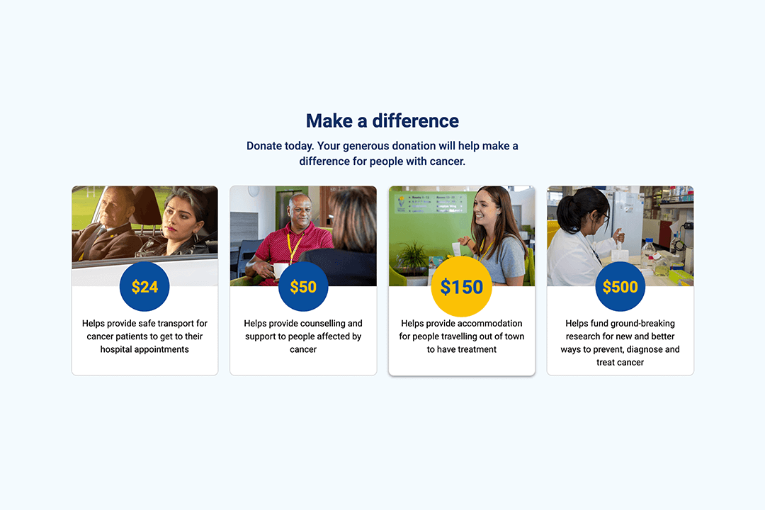
A charity website can have multiple goals, like getting donations as well as volunteering and general marketing strategies. The CTAs should use actionable language, be noticeable and clickable on a webpage, and include a clear value proposition even if it's just to "Learn More" on a particular topic. For the Cancer Society website, we designed and built content blocks that focused on campaigns. The Cancer Society content managers can go into the CMS and create their own campaign content blocks, like a petition to help reduce the sale of tobacco. These content blocks are designed so that it is easy for our client to edit them but also keeps consistency with the overall design of the website.
Donations
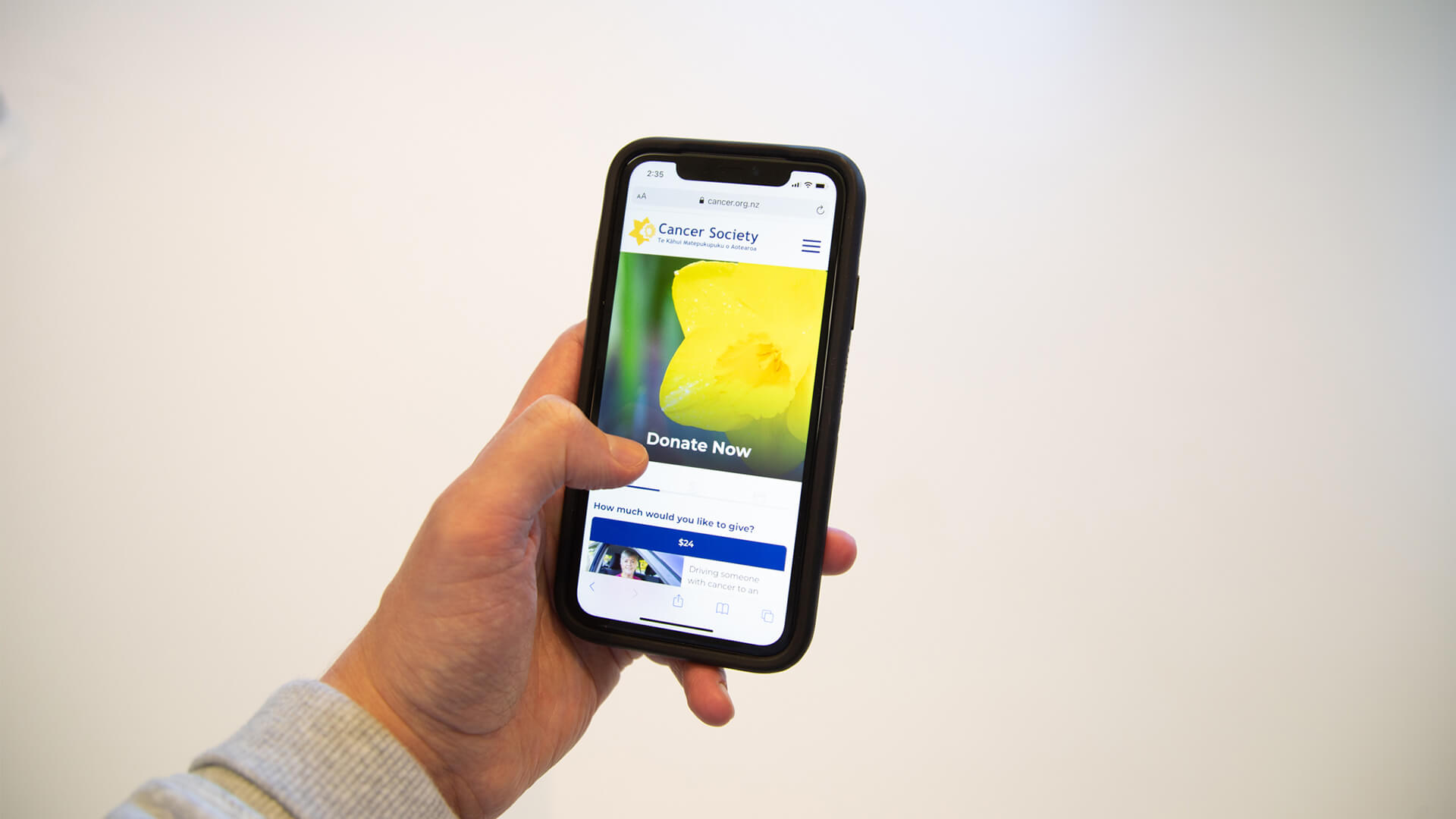
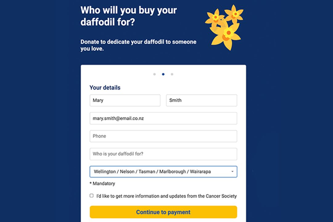
The donation process needs to be as simple and easy as possible for the user. We've found that improved usability has resulted in higher conversion rates. For example, we were able to drastically improve the overall usability of the online donation process for Daffodil Day. Having very neat and tidy ways of showing content and small yet intuitive micro-interactions make a big difference to the overall UX of the donation journey. The new Daffodil Day site displays simple yet very digestible content and payment details are handled on the site rather than on third-party platforms. All of these changes provide the user with trust towards the site as well as a clear path to make a confident donation. By getting the usability, design, and flow correctly by following best practices and the donation conversion rates have increased.
Conclusion
To recap simple ways to improve your charity or not-for-profit website include:
- Telling your story and being clear of your overall cause
- Understanding your audience: building a website that is user first
- Creating visually compelling web design for nonprofits with images and videos and cutting down on lengthy paragraphs
- Calls to action that help you convert and retain users
- Optimising your donation platform so that is easy to use and clear about what a user is donating towards and how it will help
At Somar Digital we can help you achieve this while trying to make it as painless as possible.
You can reach us any time at the link below.
