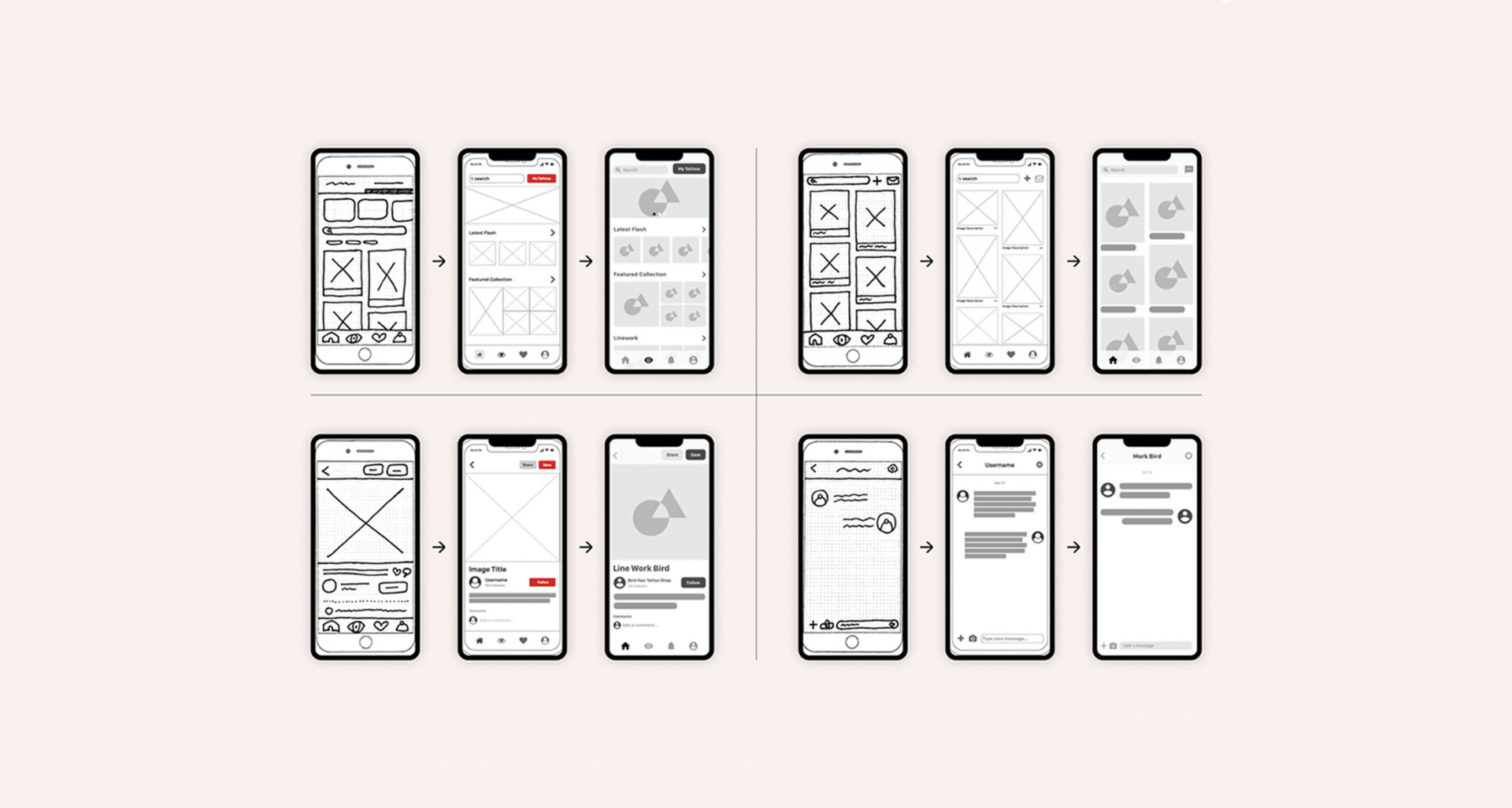
We often get asked how we accommodate for this and how our UX approach differs from project to project. This blog discusses how we at Somar create effective digital products for a diverse range of users.
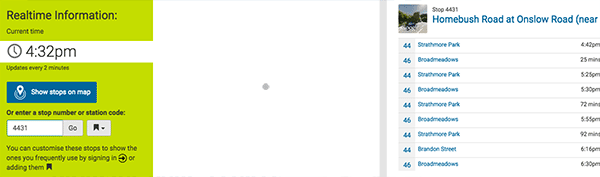
Somar’s websites cater to a wide variety of audiences - from all ages and cultures, both locally and Internationally. For example, we designed the Metlink website for everyone who travels on Wellington public transport, from school kids through to the elderly - including both residents and visitors with little knowledge of the region.
We often get asked how we accommodate for this and how our UX design approach differs from project to project. We start every project with the same intention: creating the best experience for the user to achieve their end goal. One aspect of this is “learnability”, or simply, how easy it is to learn how to use a product or website.
Take microwaves for instance - while they are quite complicated machines, with dozens of different models and brands - most users can operate a new microwave because they all centre around a similar interface. As new microwaves come onto the market, they adopt this interface because it is familiar to their audience and has very high learnability.
This same principle applies to a lot of the UX decisions behind website design. For example, you’ll see sign-in (or login) buttons nearly always in the top right-hand corner of a website - as users have learnt to look in that area of the screen for that particular action.
Here are some other common techniques that we use to improve UX learnability:
Use clear signifiers and User Interface (UI) patterns: Humans are visual creatures who are built to recognise patterns. This is why we are surrounded by signifiers, such as red octagon stop signs on streets, or an envelope icon to represent email. Using basic colour theory and iconography when building the UI increases visibility and cognitive recognition for our users, resulting in a more efficient experience.
Use tactile feedback: As a user there’s nothing worse than clicking a link on a website - then waiting, unsure of whether the site is loading or if you need to click again. Tactile feedback ensures that the user feels confident when navigating your website. As part of our design process, Somar ensures a library of different tactile states for GUI elements (ie: hover and click states for buttons) are in place to help aid the user when interacting with the site.
Use white space as a design tool: White space, or emptiness on the screen, can improve comprehension by up to 20% when used correctly. Good spacing between elements and text creates breathing room, allowing users to digest small sections at a time - rather than everything hitting them at once.
Ensure Content Hierarchy: This is what we call “onboarding” where we ensure that the most important areas of your site are seen first. We guide our clients to focus on the content and features that will be used the most by employing the 80/20 rule - i.e. which 20% of your site will be used 80% of the time? Your site needs to be concise, well structured and use visual techniques to emphasise these important areas.
At Somar, we pride ourselves on creating efficient and effective user experiences. We would love to talk to you about how to improve your site’s performance online.