One of the techniques shunned by designers is making a comeback. Almost overnight, it seems that gradients are popping up in website designs everywhere.
At Somar Digital we are often looking at emerging and evolving web design trends, and the return of the gradient is one that we’re particularly excited about. Around four years ago, flat design (the trend of minimum use of colour and large basic geometric shapes without much embellishment) was everywhere. It became popular after Google started using flat design across its interfaces and coined its own term and guidelines titled Material Design.
While this minimal approach of simple colours and white space was definitely appealing, it was restricting in terms of UX design due to the lack of depth and ability to make content stand out.
However, the biggest problem was every flat design website started to look the same.
Examples of flat design websites:
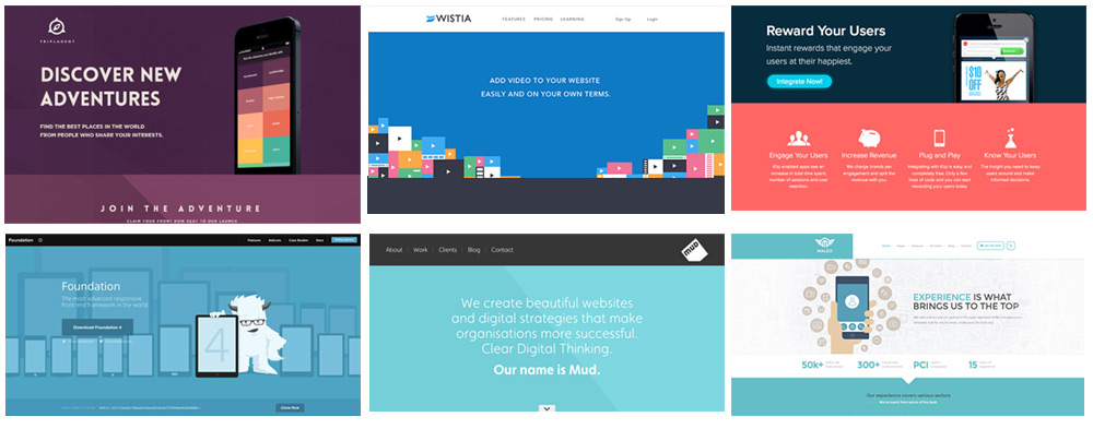
While all of them were visually acceptable - most of them were not memorable. More importantly, just because a website looks good, it doesn’t mean it’s performing well in terms of usability and conversions.
Just like Google made flat design popular, it appears that other trend-setters have kick-started the revolution for the use of gradients. Trend-setters in the world of UX and UI design are typically digital products which come into our lives on a daily basis - such as Spotify, Apple Music, and Instagram. Because we see them everyday they start to become acceptable and are looked upon as cutting edge (after any initial shock reactions from those adverse to change).
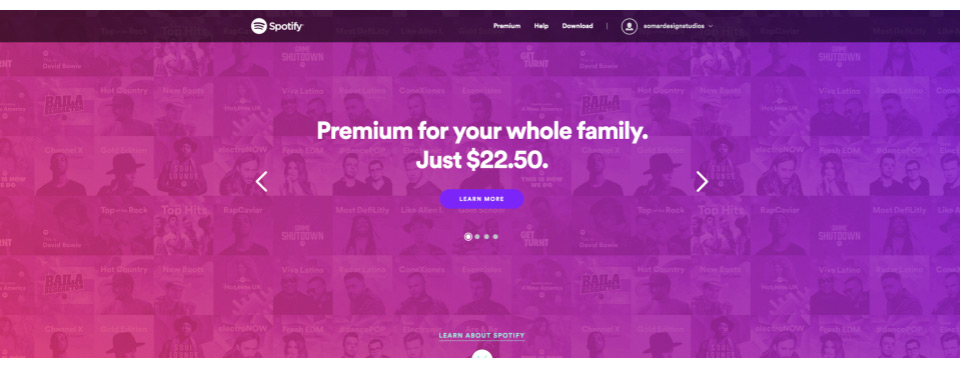
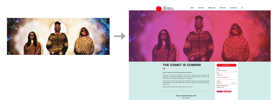
All three of these companies have started using gradients to great effect within their products, and the end result is a much more vibrant and colour rich online experience. It’s something that Somar have been embracing for a while now, and the Wellington Jazz Festival 2017 website is a great showcase for how effective gradients AND flat colours can work together. We played around with the colour space for the brand, injecting in subtle animations and transitions to breathe some life into the website.
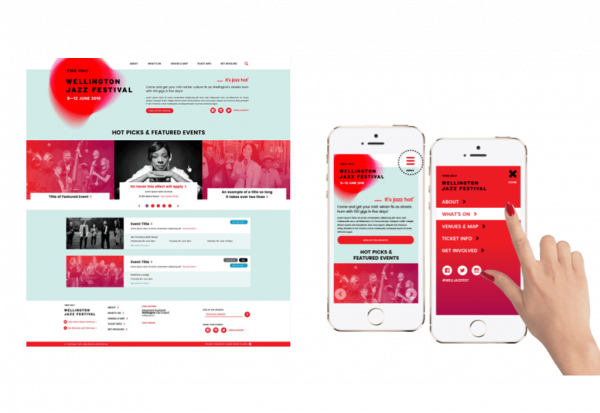
Jazz events and photos were dynamically given a visual treatment - removing the need for the client to need any Photoshop capabilities. Instead, images could just be uploaded to the CMS and automatically appear on the site with the correct gradient effect applied.
There are still some rules when using gradients however. The use of two-tone gradients, where the colour shifts between two or three colours sequentially along a spectrum works well. Examples of gradients which have been poorly received was the controversial rebrand of Instagram at the end of 2016 - which was basically a rainbow gradient, seemed to push the boundaries a little too far. However, you can definitely see what Instagram were trying to do.
Compared to Facebook and Twitter, who both use safe single-tone blues in their identities, Instagram wanted to show how different they are as a platform. Their logo, while a bit harsh on the eyes, definitely conjures up a fun and vibrant world, mimicking a Miami sunset and all the associated ideas that come with it.
Conclusion
Here at Somar, we are always looking for design inspiration and emerging design trends. We like to learn from the trend-setters, but also inject our own design experience and insights to help elevate your brand, and also engage with your users to make your website memorable and effective.