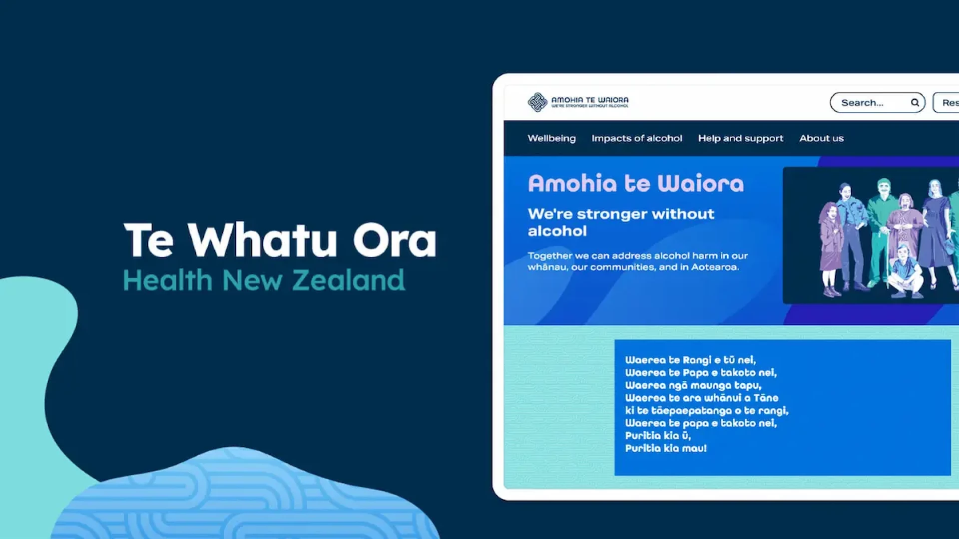
Alcohol.org.nz website UX Research
Using UX Research to better align the Alcohol.org.nz website with a Māori audience
Somar Digital designed and developed the Alcohol.org.nz website for Te Hiringa Hauora | Health Promotion Agency (now part of Te Whatu Ora - Health New Zealand). The Alcohol.org.nz site provides information, advice, research and resources aimed at breaking the cycle of alcohol harm in Aotearoa.
There was a significant UX Research component to the project with a key goal to reflect Māori drinking culture and Māori priorities in the alcohol space. The previous Alcohol.org.nz site attempted to talk to all people about all things alcohol. The new site needed to be for Māori first and foremost. It was vital to understand what talking and thinking about alcohol, online, looks like from a Māori perspective.
Project kaupapa

Somar Digital sought approval from the New Zealand Ethics Committee - Te Roopu Rapu i te Tika because of the sensitive nature of the content of the website. This was a best practice research approach and was an invaluable process where the Somar Digital team learnt how to navigate traditional academic constraints with modern UX and design practices within a predominantly Māori context. Whānau are the most trusted source of primary support and the first option for many in seeking information.

Discovery - round one interviews
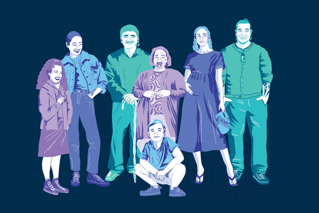
Qualitative research was undertaken to better understand the audience and their needs for this particular tool — an online information-based website. This involved conducting individual 1-1 sessions including interviews with several members of the same whānau. Rather than presenting a defined solution to the audience, it was important to understand background and common experiences in the discovery round. Feedback was gathered about what was, and wasn’t working on the existing site.

Information architecture
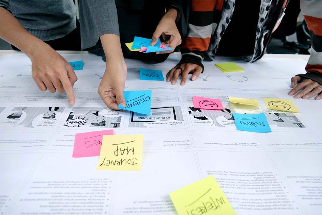
The first iterations of information architecture were informed by key findings from the round one interviews. In particular, underpinning values such as whānau first and kids first. Two sessions on Figma were conducted as a remote team. These sessions involved the lead UX and research designer, and the cultural advisor representing round one findings. From this point, the project lead and cultural advisor took this working draft to border teams. Our cultural advisor reviewed with their team internally.

Wireframing, content and prototype creation
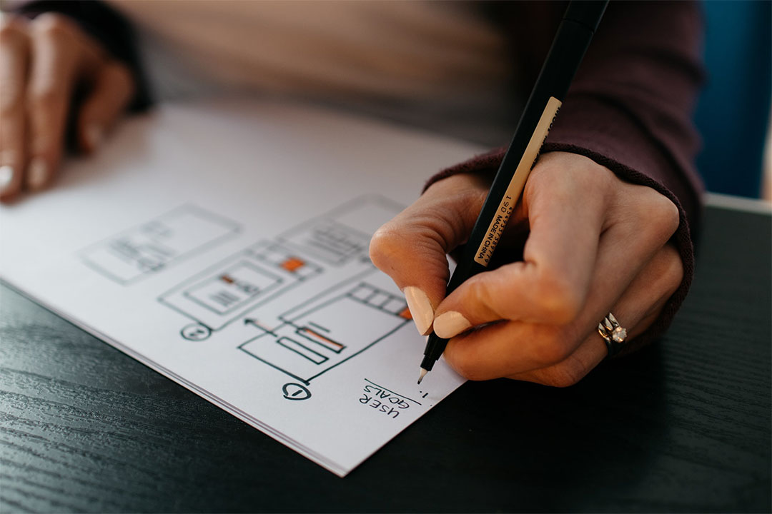
Using the findings from round one, and then the iterative process of creating the draft information architecture a prototype was created which covered key templates that would later be used in the built website. These were some of the areas of concentration that were wireframed and turned into a prototype:
- Homepage
- Main navigation and first and second-level IA
- Tamariki and Mokopuna
- Health services search and map

Usability testing - round two interviews
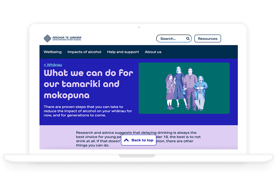
The round two interviews consisted of speaking to 10 participants. This time participants were interviewed while testing the prototype. Based on this round of research, decisions were able to be made about:
- Tone of voice and written style
- Website look and feel (within brand guidelines)
- Imagery — including photography and illustration style
- What content types resonate with the audience
- What kind of digital tools would be appropriate for these audiences
- The use of Te reo and Te Ao Māori concepts — and if they are appropriate in this context
- Key navigation and usability of the site

Key Takeaways
These included:
- The want for real stories and experiences was the stand-out theme from this round
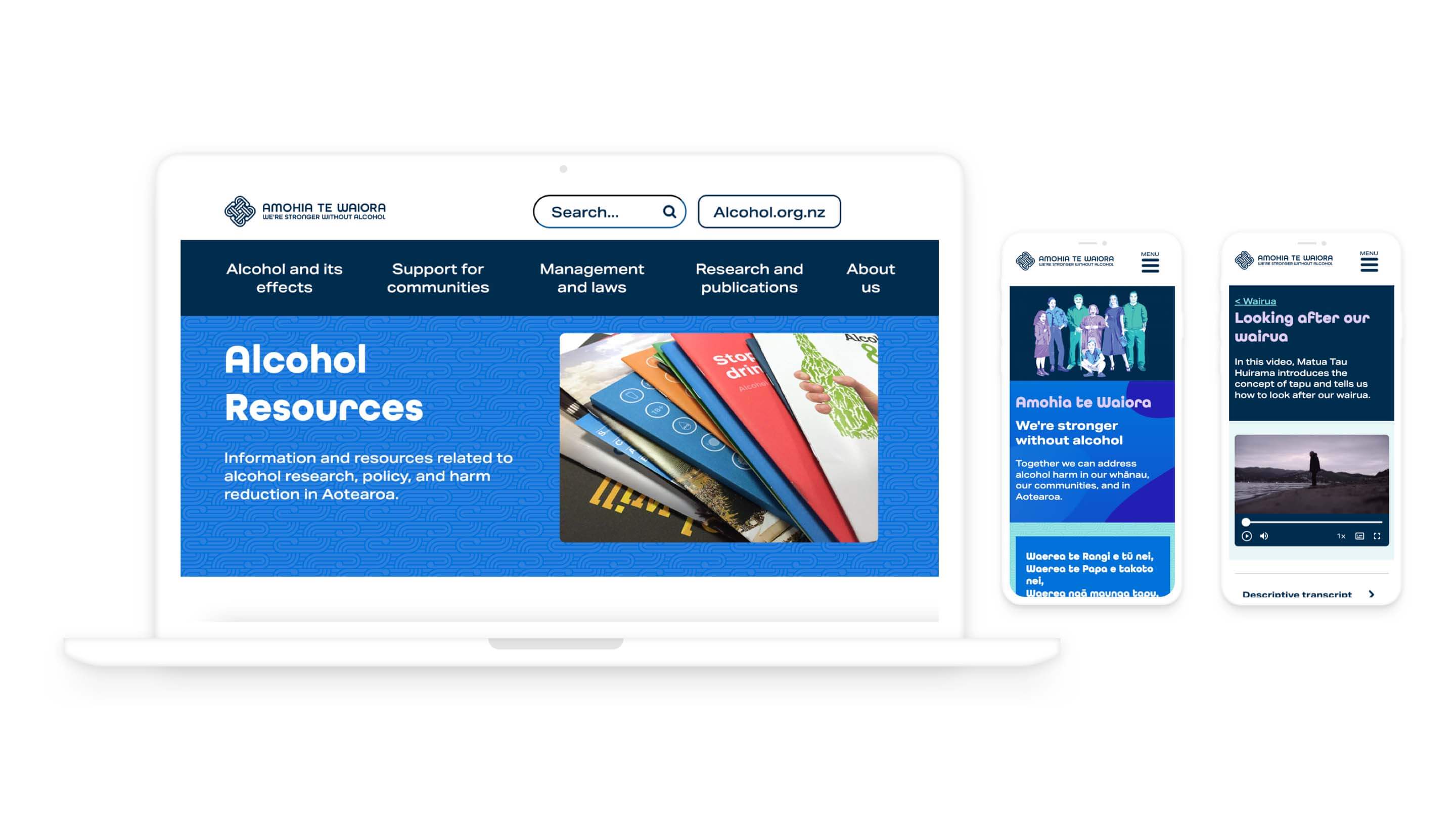
- Making sure this site had a heavy emphasis on being responsive
- Using a mixture of realistic imagery and illustration to build richness to the final website
- Continuing to have discussions around how much of a Te Ao Māori lens is used
- The tone of the content was on the right track
- The structure and size of the site seem to be overall understood and easily navigated.
