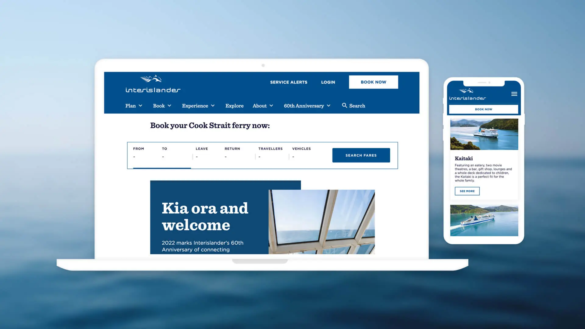
Interislander website
Building a new Interislander website that drastically improves customer experience
KiwiRail brought Somar Digital onboard to completely redesign and rebuild the Interislander website.
The key business requirements for the redesign were fixing the site’s usability and navigational issues with the goal of making major improvements to the site’s customer experience.
New website
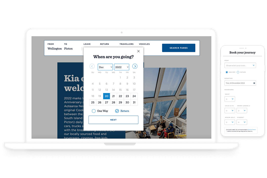
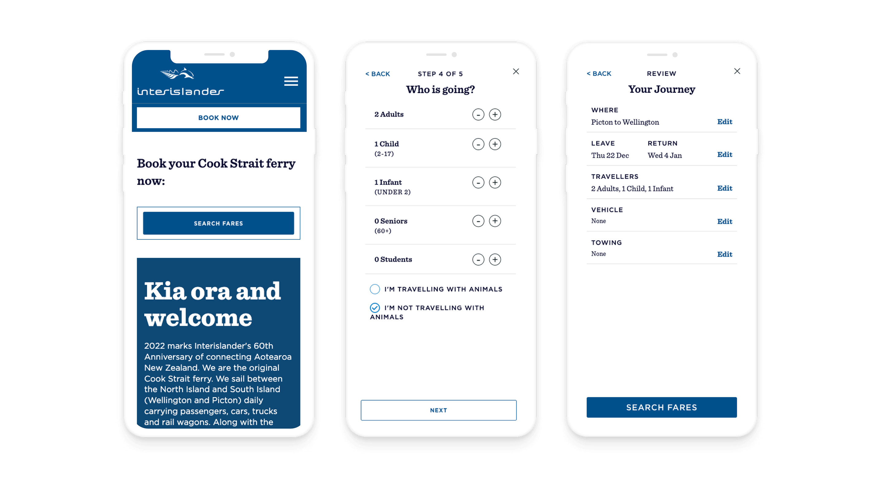
The redesign of the website is part of a concerted effort by KiwiRail to move away from a brochure-style website and towards a site that provides greater value to their customers and makes their journey and experience with Interislander as stress-free as possible. Like all the projects we take on at Somar Digital we took an Agile approach to delivering the new site. More features to be built into the site are planned after the site went live.

Improving user experience

KiwiRail wanted to making the new Interislander much more usable for the customer. The focus was on optimising the UX of the site by updating the navigation. The site’s menu’s have been simplified to align with what Interislander customers use the site most for. This includes planning, booking and general information about the ferries. Major structural changes were made to the homepage as well so that it was less cluttered and featured only the most relevant information.

More features
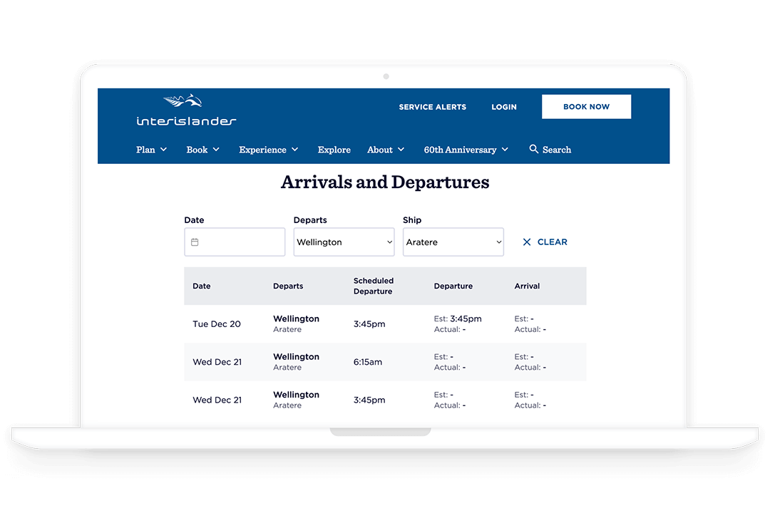
Moving away from a more brochure style website we added a number of new features to the site which are geared towards adding tonnes of value for Interislander customers. The timetable is now dynamic and stays up to date. Customers are also able to sign up for push notifications for updates on services, like delays. A Where is my Ferry was also built so that customers can see exactly where their ferry is on a map in RTI (real time information).

Easier for the client
One of the key deliverables was making it much easier for admin to edit and load content onto the new site. With SEO as a focus, putting together content pages that are search optimised is much simpler than before. Admin are able to login to the CMS and make the necessary changes and keep the site as up-to-date as possible. Removes hassle for Interislander admin to update website easily.


Results
More user friendly
The user flow has been vastly improved. This means it is much easier for users to find what they are looking for and it is much more straightforward to complete a desired action such as book ferry tickets or see the latest timetable.
Saving customers time
The new site cuts down on the time it takes for the process of catching a ferry. Looking for a ferry to catch and making a booking through to getting to the terminal itself is a more streamlined process than before.
Greater transparency with customers
Huge benefit for customers including commercial services like truckies who can know when their ferry is on time or delayed before they reach the terminal - that use the ferry regularly. More modern approach to customer experience with feature like customers being able to decide how they would like to be notified how they receive important alerts like ferry delays.
