Ministry for Pacific Peoples | Web Design
Delivering a vibrant website for the Ministry for Pacific Peoples that reflects the needs of the Pasifika community in NZ
Ministry for Pacific Peoples (formerly known as the Ministry of Pacific Island Affairs) is the principal advisor to the New Zealand Government on everything from public policy to programme and service decisions affecting Pacific peoples. Their aim is to ensure that the Pasifika community in New Zealand is successful in all aspects of their lives.
MPP came to Somar Digital to build a website that helped them engage better with the Pasifika community and told MPP's story more clearly.
Respect for culture
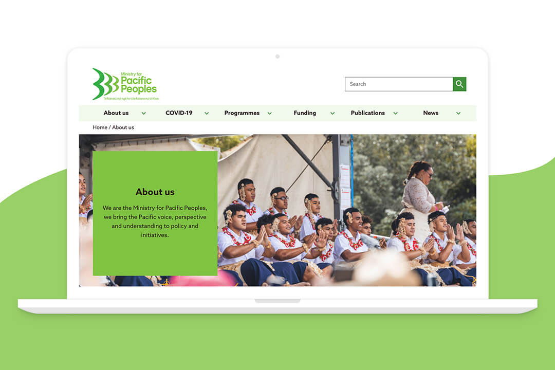
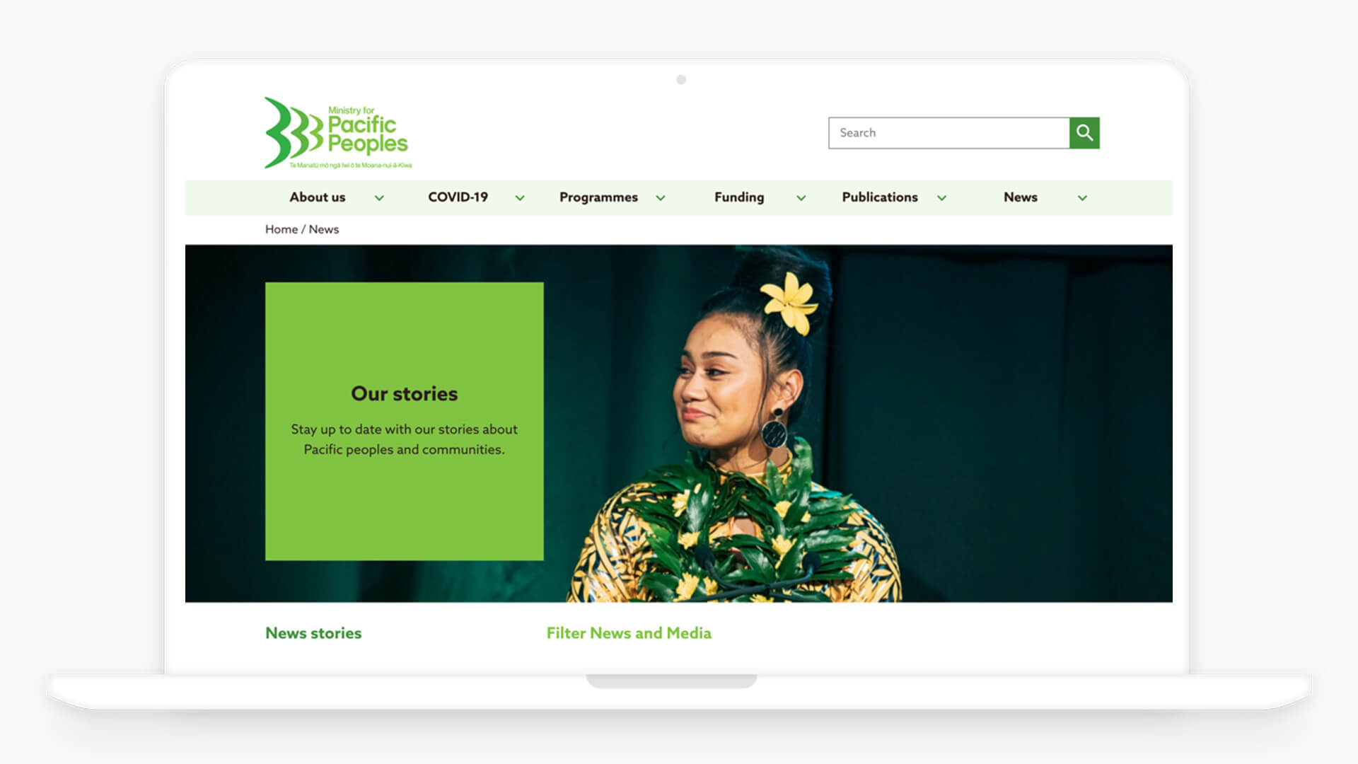
The Ministry of Pacific Peoples policy is to support and encourage Pacific peoples and culture, and the website needed to reflect this in terms of design and usability. At Somar Digital we have a deep respect for local cultures including Māori and Pasifika. To make sure that we were designing a website that met the needs of the Pasifika community we undertook a user experience research project before the project begun. This research piece involved members of the Pasifika community from across NZ and we were able to gain invaluable insight into the overall direction of the project.

Positive Change
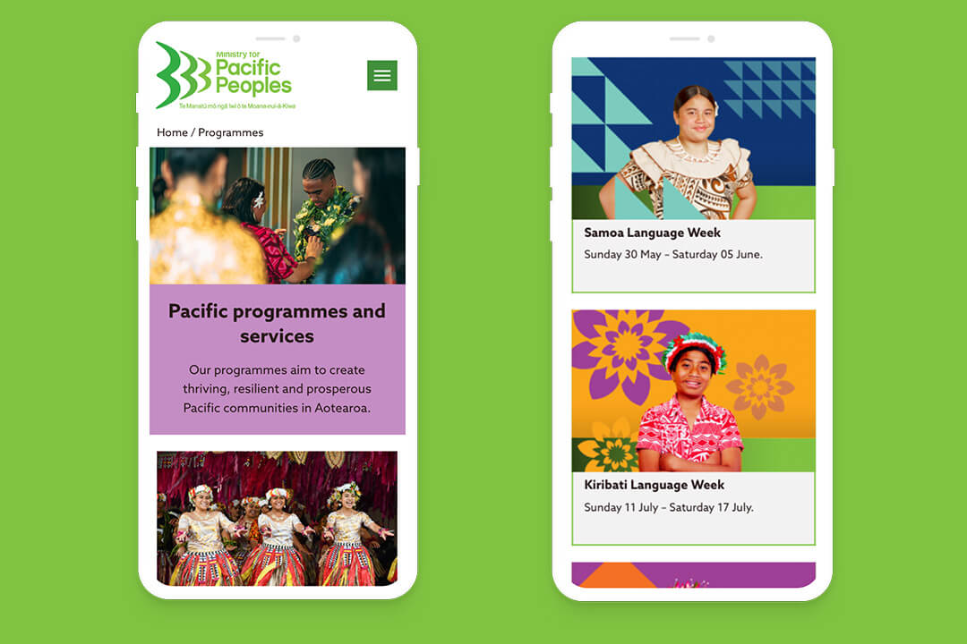
The website needed to reflect the vibrant community that it represents, as well as deliver a large amount of information to users with varying access to technology. We developed a Silverstripe solution to allow the Ministry to manage their own content, with a number of features including a dynamic Social Media feed for Twitter and Instagram, and an e-newsletter module to strengthen their communication channels online.

Bringing it together
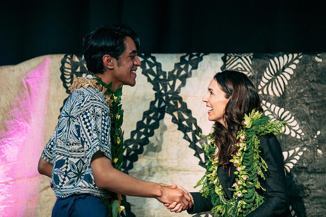
As part of their future strategy, the Ministry wanted the flexibility to be able to include subsites for their other initiatives such as the Prime Minister’s Pacific Youth Awards programme, and Toloa Scholarships. Bringing these together under one roof required a customisable template and adaptable content management system, but the end result is a cheaper, more efficient process for the Ministry when updating subsites.

On brand

The brand was created by two students during their time at Manukau Institute of Technology (MIT), as part of the Ministry’s approach to supporting young Pacific peoples and to reflect the community. Because of this, there wasn’t a brand guideline document or logo suite, so the Somar design team worked together with the Ministry to refine their logo and create a series of web-based brand guidelines to ensure consistency.

Shifting timelines

The Ministry of Pacific Peoples project had a number of moving deadlines that needed to be met, with high-end sign-off required by Ministers and training sessions to ensure that the administration team could populate and maintain the website. Somar employed an agile approach to the project so that the Ministry could prioritise the design and development stages to best suit them.


Results
Visual Deisgn
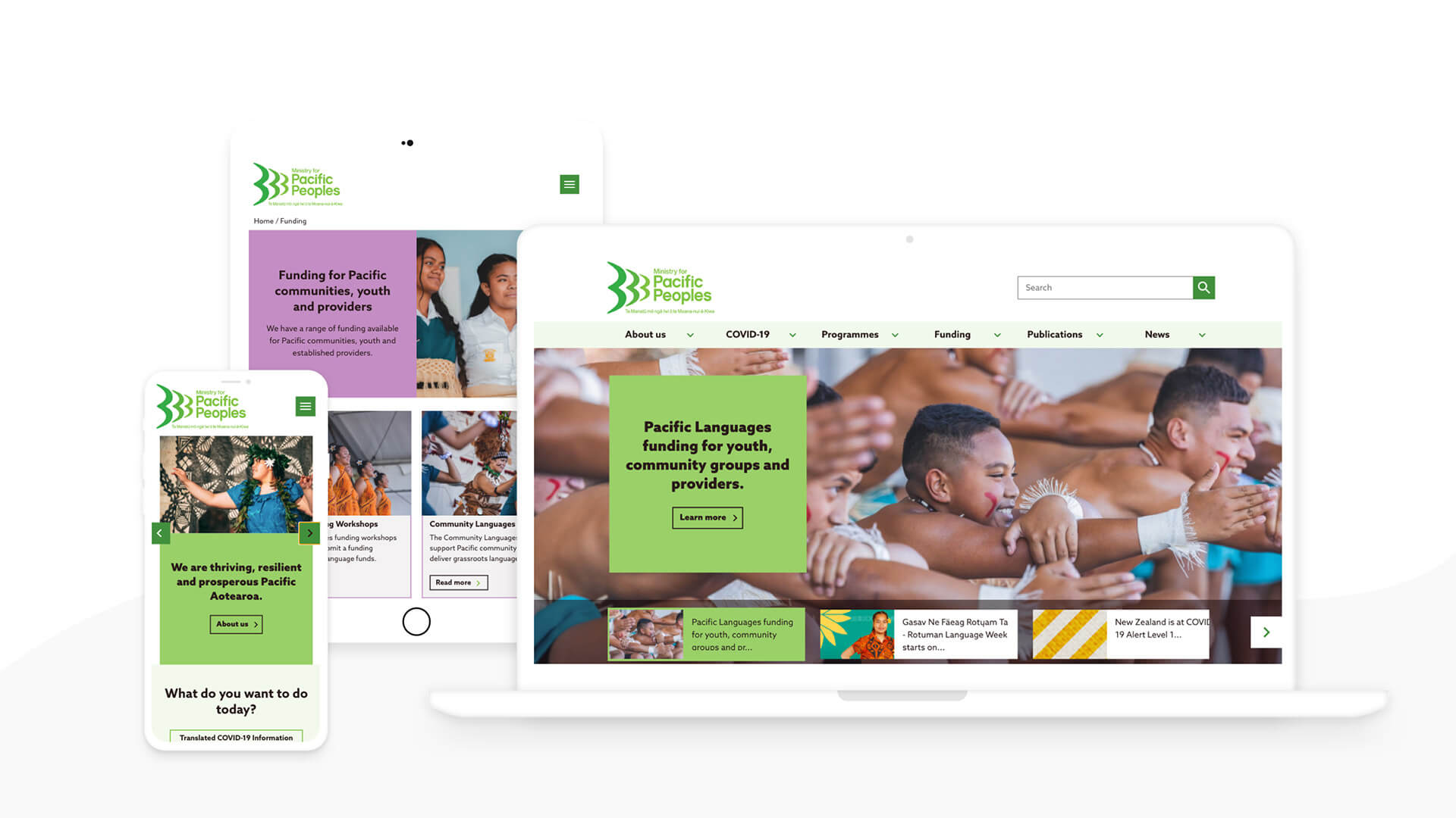
The new website was brought up to the times and feels more modern than the old site. More importantly, we created content blocks and web design that helps MPP load content that is more visually focused like images and video as opposed to their old site which was too wordy. This gives MPP the opportunity to add more visual content to their website which helps with user engagement and interest.
Improving navigation and usability
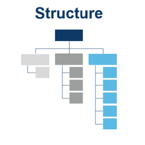
We had to make sure that we nailed down the right Information Architecture which meant arranging and organising the content of the website to enable users to conveniently find the information required for completing a task. We then tested and refined with treejack testing. Defining the homepage focus helped to improve the navigation system by creating a navigation system based on the IA that will provide users with immediate and obvious pathways.
Identity and purpose
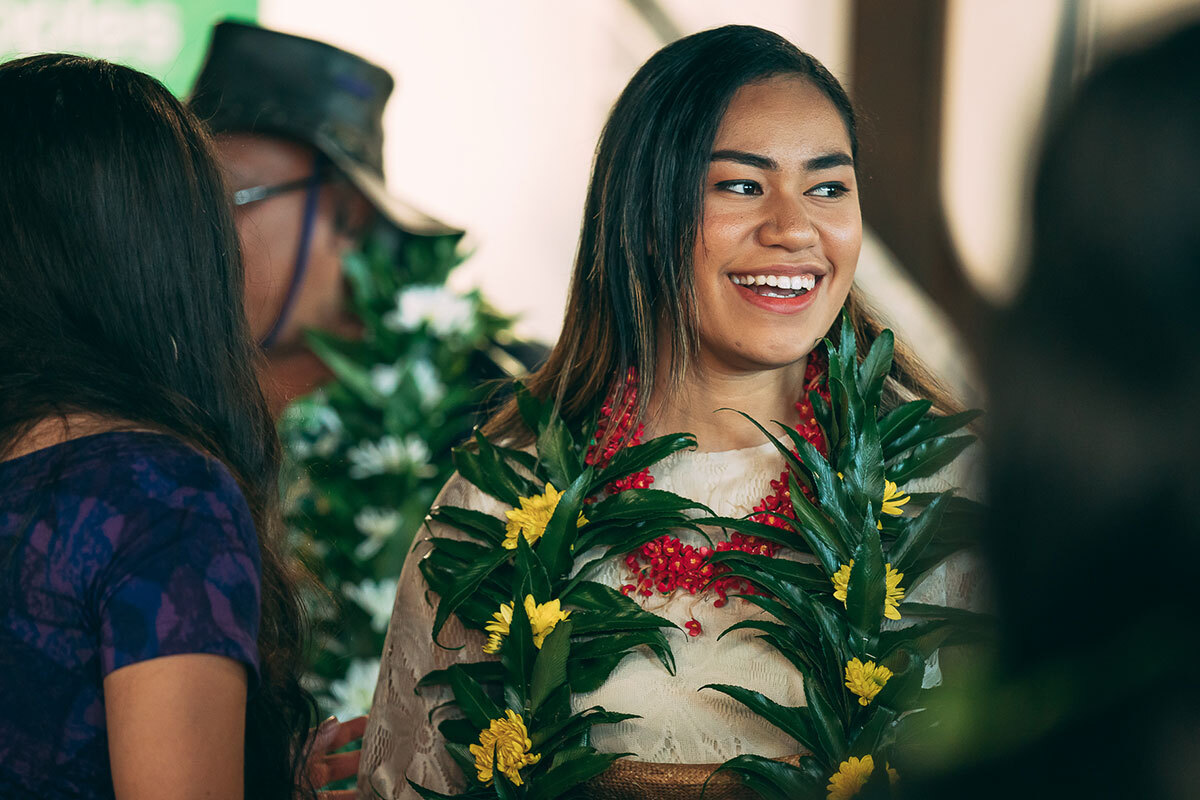
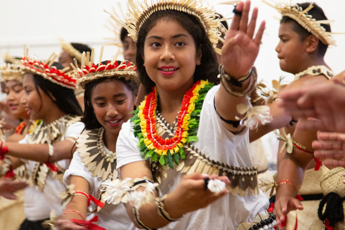
We designed the homepage to give a valuable snapshot of who MPP is and what they set out to achieve. This builds a rapport with uses and encourages further engagement, especially with a younger demographic. The Pacific community is very proud of their heritage and who they are and love to celebrate the vibrancy of their culture. The website feels much more in keeping with the Pacific community. Somar Digital worked closely with MPP to make sure this was the case.
Leveraging other channels
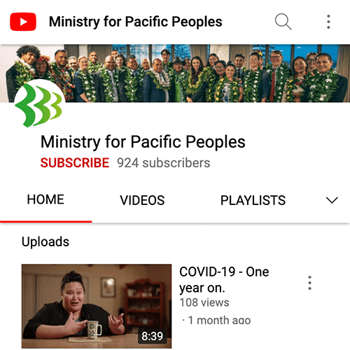
Understanding that the website is one aspect of MPP’s outreach and making sure that social media channels, communication channels, and promoting events and festivals are an important aspect of the new website. Simple solutions like making sure that the relevant social media links and references are strongly displayed help MPP engage with their intended audience. Overall, the new website does a much better job of communicating what MPP do by helping MPP engage with a wider audience.
